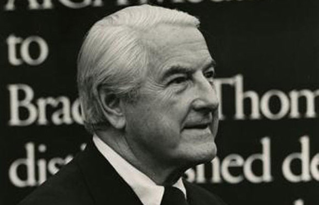
Bradbury Thompson was a prominent name among the twentieth century American graphic designers and art directors. His iconic achievements were recognized by every major American design organization including AIGA, National Society of Art Directors and Art Directors Hall of Fame.
In 1911, Bradbury Thompson was born in Topeka, Kansas. He received his formal art education from Washburn College and in 1934 earned his graduation degree. He designed the college’s mascot, “The Ichabod”, in 1937. Upon graduation, he joined Capper Publications as a designer where he worked for a brief period yet thoroughly learned every aspect of printing production. After leaving Capper Publications he relocated to New York, in 1938. Henceforth, began the years of Thompson’s zealous learning, polishing of skills and application and expansion of his talent. During this period, he embraced every graphic design opportunity he could. Some of the firms and magazines he worked for included the Rogers-Kellogg-Stillson printing firm and Mademoiselle magazine.
Moreover, he provided consultation and designed for Westvaco Corporation. His life-long successful career is filled with impressive work. Thompsons’ three projects in particular that epitomized the graphic designing scene of that time. He worked for a promotional magazine, Westvaco Inspirations, an extension of the Westvaco Paper Corporation, where he designed more than 60 issues. Through the magazine he reached thousands of typographers, students and print buyers. Thompson possessed a curious ability which allowed him to blend together classic typefaces and historic illustrations with modernist typographic organization.
In addition to graphic designing, Thompson also accepted a teaching position at Yale University where he resided for several years. Making use of modest resources, he did his best to become an inspiring teacher and guide. Thompson shed light on typography and the role of typographic designer. According to him, similar to architecture the art of typography is concerned with beauty and utility. A typographic designer is responsible for representing the art of previous ages as well as of the present time. While designing, the designer must add spirit of his own time even when representing past centuries. Instead of making perfect imitation of previous works, the designer must demonstrate the understanding of past works in his piece of art.
Thompson published a monumental work, entitled The Washburn College Bible. Since Gutenberg’s edition of bible’s assessment of its typography, Thompsons’ book is deemed a landmark in the publishing of book on that subject. The book features Jan Tschichold’s Renaissance-flavor typeface Sabon and each chapter open with the beautiful reproductions of paintings based on biblical stories. While assessing and analyzing the Christian text, the book kept a sacred tone and held reverence for the biblical text. Besides, Thompson was an avid collector of postage stamps and a great interest in contemporary stamp designs. He is credited for providing designs for about 90 postage stamps. In fact, he also consulted with the U.S. Postal Service and assisted them in designing several other stamps. What sets Thompsons’ designed postage stamps apart from others is that they scrupulously capture the American history and culture. Some of his famous stamps’ designs include the 1984 ‘Love’ stamp and the 1980 colorful painting of Josef Albers, ‘Learning never ends’.
1995 is marked as the year of departure of one of the most influential and admired artist of the twentieth century. In his lifetime Bradbury Thompsons received several accolades including National Society of Art Directors of the Year Award, induction into Art Directors Hall of Fame, Frederic W. Goudy Award from RIT and AIGA Medal.

