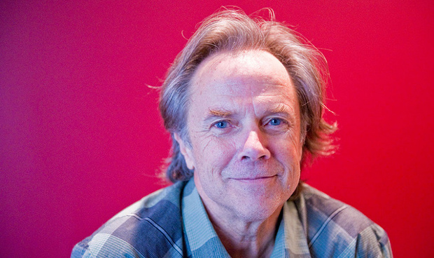
David Carson is a prominent contemporary graphic designer and art director. His unconventional and experimental graphic style revolutionized the graphic designing scene in America during 1990s. He was the art director of the magazine Ray Gun, in which he introduced the innovative typographies and distinct layouts. He is claimed to be the godfather of ‘grunge typography’ which he employed perpetually in his magazine issues.
On September 8, 1954, Carson was born in Corpus Christi, Texas. He went on to study Sociology from San Diego State University and graduated with a Bachelor of Arts degree. He touched upon graphic designing briefly while attending a two-week commercial designing class at the University of Arizona, in 1980. Subsequently, he attended the Oregon College of Commercial Art to study graphic designing and a three-week workshop in Switzerland as a part of his degree. He also took up a teaching job at a Californian high-school where he taught for several years. Besides, his many talents include professional surfing and he was ranked 9th best surfer in the world, in 1989.
David Carson embarked on his passion for graphic designing in his later life. In the beginning he worked as a designer for a magazine, Self and Musician, covering surfers’ interests. His early experiences also include working for Transworld Skateboarding magazine which paved way for his experimental designing. He became the art director for the magazine in 1984 and revised its style and layout until his tenure ended. During his time at Transworld Skateboarding, he developed a signature style with the use of unconventional ‘dirty’ type photographic techniques. In 1987, he also lent his expertise to the extension of the magazine, Transworld Snowboarding.
In 1989, he was landed a job at the magazine Beach Culture, as an art director. After the publication of only six issues, the magazine folded. Notwithstanding, Carson made a name for himself through the opportunity, as his designs were recognized for his for his unique style and typography and consequently earned over hundred design awards. In 1992, he was offered a job at an alternative-music magazine Ray Gun, whose publisher saw true potential of his graphic design skills. Once again, Carson proved himself as he tripled the magazine’s circulation and attracted a wide readership. In fact, to keep the spirit of the magazine alive he notoriously published a tedious interview with Bryan Ferry in Zapf Dingbats (symbol) font.
His work is characterized by the chaotic typography and pattern it embodies, disarray of photos overlapping each other, seemingly meaningless at the surface but holding a larger picture. To put in simpler words as Albert Watson stated, the disorganized use of his typography has its own purpose, such as the each stroke of a painter’s brush evoke different emotion, imagery and idea, so does Carson’s designs possess such attributes. Where his innovative style of visual communication attracted new readers it also repelled many who considered his work fractured, hence misleading.
Although his covers for Ray Gun were often radical and bold, it fascinated the young readership, thus the big corporations also hired him for their brand advertisements through both print and electronic media. In 1995, Carson quit his job at Ray Gun and established his own firm, David Carson Design. He signed contract with a host of major corporate clients, including Nike, Pepsi Cola, Ray Bans, Levi Strauss and MTV Global among others. Additionally, he published a comprehensive collection of his graphic works The End of Print: The Graphic Design of David Carson (1995) and other highly experimental works; 2nd Sight, Trek and Fotografiks.

